Monday, April 10, 2017

Calculating Volumes of Stock Piles Using Pix4D and ESRI Software

Introduction

In a previous exercise, the Litchfield Mine imagery was process in Pix4D that contained several stock piles. For this exercise, the volumes of select piles will be calculated from these data sets using both Pix4D and toolbox operations in ArcMap. The differents methods used and their results will then be compared.

Volumetric Analysis Overview

Volumetric analysis involves the measurement of a volume using a variety of methods. Volumetric analysis has several applications including, but not limited to:
  • Calculating the amount of silt deposited on a lake bottom
  • Calculating the amount of material removed at a mining site
  • Track the progress of clearing debris piles
UAS are able to capture precise images from which mosaic images and 3D models can then be produced and volumetric calculations can be made. The quality of the aerial images are important to producing results that are superior to traditional ground based methods.

Toolbox Operations

In order to engage in analyzing the volumes of each pile, the following toolbox operations in ArcMap described below will be utilized:
  • Extract by Mask: clips a raster using a polygon shape according the defined extents or to the shape of an input polygon feature class; the shape defining the clip can clip the extent of the raster or clip out an area within the raster where the clip output includes any pixels that intersect the extent; for this exercise, a feature class will be created for each pile that includes the entire pile while excluding any other piles and this polygon will then be used for the clipping extent
  • Raster to TIN: converts a raster to a triangulated irregular network (TIN) dataset; a variety of analytic operations can then be performed on these TIN surfaces; after each pile has been made into a feature class and clipped, it will then be converted into a TIN surface
  • Add Surface Information: attributes features with spatial information derived from a surface; polygons summarize the surface Z properties within its area; this tool will be ran on the polygon clips of each TIN as a way of adding Z data
  • Surface Volume: calculates the area and volume of the region between a surface and a reference plane; a Z factor must be applied to ensure the accuracy of volume calculations when the surface Z values are expressed in a different unit of measure than the XY units
  • Polygon Volume: calculates the volume and surface area between a polygon and terrain or TIN surface; calculations will only be made for the portions of the input polygons and the TIN or terrain dataset surface that overlap; the volume represents the region between the surface and the space above or below the polygon features based on the selection made in the Reference Plane parameter:
    • Calculate Above the Plane: volume is calculated between the plane and the underside of the surface
    • Calculate Below the Plane: volume is calculated between the plane and the topside of the surface; the surface area for the same portion of the surface is also calculated
  • Cut Fill: calculates the volume change between two surfaces; enables one to create a map based on two input surfaces - before and after - displaying the areas and volumes of surface materials that have been modified by the removal or addition of surface material; both the input raster surfaces must have a common origin, the same number of rows and columns of cells, and the same cell size; for accurate results, the z-units should be the same as the x,y ground units

Methods

Use Pix4D to Calculate Volumes

To save time on processing, the data generated in Pix4D in the previous exercise Processing Pix4D Imagery with GCPs will be copied and pasted into a new folder for this week's exercise. Once this is complete, open the saved Pix4D project.
Figure 1: Calculating volumes in Pix4D

Step 1: Click on the 'Volumes' tab located on the far left side (Figure 1). Underneath the 'Objects' tab on the upper left side, click on the 'New Volume' button (the one on the left that has the shape of a cylinder with a plus sign on it). Zoom into the image and pick a pile to analyze.

Step 2: Once a desired pile has been picked, follow the prompts on how to draw a shape around the pile - left click to mark vertices along the base of the pile then right click to add the last volume and create the volume base.

Step 3: Once step 2 is completed, a message will appear in the 'Volume #' box with a message saying "The measurements have not been computed yet" with a 'Compute' button underneath the message; click on the 'Compute' button to calculate the volume

Step 4: Repeat steps 1-3 until three piles have been computed and take note of the volumes computed for each pile


Use 3D Analyst to Calculate Volumes of a Raster Clip

Open a new blank map in ArcMap. Add the DSM and the orthomosaic generated by Pix4D of the Litchfield Mine to the map.

Figure 2: New Feature Class window
Step 1: Create a new file geodatabase in a personal folder where all data will be saved. Then create three polygon feature classes and name them for the raster clips (e.g. Pile3Clip) by right clicking on the created geodatabase > New > Feature Class. This will bring up the 'New Feature Class' window (Figure 2).
Figure 3: Editing feature classes 
 Step 2: Right click on the feature class for the first pile and select Edit Features > Start Editing. The 'Create Feature' window appears that allows for the creation of polygon shapes. Select the Rectangle construction tool and draw around the first pile making sure to capture the entire pile while not including one of the other piles (Figure 3). Repeat this step for the other two piles. When finished, in the Editor toolbar, select Editor > Save Edits, then Stop Editing.

Figure 4: Extract by Mask tool
Step 3: Next, in the search toolbar, search for 'Extract by Mask' and select the Extract by Mask (Spatial Analyst) tool. This will bring up the 'Extract by Mask' window (Figure 4). Under 'Input Raster' select the DSM and under 'Input raster or feature mask data' select the feature class clip for the first pile. Under 'Output raster' save it to the file geodatabase created earlier (e.g. Pile1Clip_clipped) and click 'OK'. Repeat this step for the other two piles.


Figure 5: Surface Volume window
Step 4: Before running the next tool, the correct base Z value must be found for each pile. Select the 'Identify' tool and click around the first pile on the extracted DSM raster (the dark black areas) and obtain a rough average Z value. Then, in the search toolbar, search for 'Surface Volume' then select the Surface Volume (3D Analyst) tool. This will bring up the 'Surface Volume' window (Figure 5). Under 'Input Surface' select the raster clip of the first pile. Under 'Output Text File' save this to the geodatabase. Under 'Reference Plane' select 'Above' and under 'Z Factor' enter in the Z value that was just retrieved using the Identify tool. Click 'OK' to run the tool. Open the attribute table of the generated text file and scroll over until the 'Volume' field is reached and record the volume of the pile. Repeat this step for the other two piles.


Use 3D analyst to calculate volumes of a TIN

Figure 6: Raster to TIN tool window
Step 1: Take all three of the raster clips that were created in the previous section and convert them into TINs. In the search toolbar, search for 'Raster to TIN' and then select 'Raster to TIN (3D Analyst). This will open the 'Raster to TIN' window (Figure 6). Under 'Input Raster' select the raster clip of choice, save it under 'Output TIN' (just in the folder, NOT the geodatabase) and click 'OK' to run the tool. Repeat this step for every pile.


Step 2: Create three more feature classes within the geodatabase and give them a name that relates them to volume (e.g. Pile2Volume). Right click on the feature class that was just created for volume in the table of contents then click on Edit Features > Start Editing. Similar to 'Step 2' in the previous section, draw polygons around each pile except this time, use the 'Polygon' option under the 'Construction Tools' and trace around each TIN pile precisely, being careful to only include the extent of the pile. Do this for all piles and then save the edits and finish editing.


Figure 7: Add Surface Information window
Step 3: Next, Z value information must be added to the attribute table of each TIN. Search for 'Add Surface Information' and select 'Add Surface Information (3D Analyst)'. This will bring up the 'Add Surface Information' window (Figure 7). Under 'Input Feature Class' select one of the volume feature classes created in the previous step. Under 'Input Surface' select the TIN that corresponds to the pile of the feature class. Under 'Output Property' select 'Z_MIN' and 'Z_MAX' and then leave all other sections in their default values. Click 'OK' to run the tool. When the tool is finished running, open the attribute table for each volume feature class and scroll over to the 'Z_Min' and 'Z_Max' fields. Record the value of whichever of the two is smaller since this will be used in the next step.


Figure 8: Polygon Volume tool window
Step 4: Next, the volume of each TIN pile will be determined. Search for 'Polygon Volume' and click on 'Polygon Volume (3D Analyst)' to open the 'Polygon Volume' tool window (Figure 8). Under 'Input Surface' select the TIN of choice, and under 'Input Feature Class' select the volume feature class that corresponds to the appropriate TIN. Under 'Height Field' select the Z value field that had the lowest value from the previous step. Under 'Reference Plane' select 'Above' and leave the other sections in their default values. Click 'OK' to run the tool. Once the tool has ran, open the attribute table and scroll until the 'Volume' field is reached and record the volume.

Volume table

Create a table that compares the results of each method. Record the volumes of each pile for each of the three methods that were used (Pix4D, Raster Clip, TIN).

Results/Discussion

Pix4D Volume Analysis

This seemed to be the quickest and easiest method for calculating volumes of the piles. It is straight-forward and only involves a couple of steps which are 1) tracing the piles, and 2) calculating the volumes at the push of a button. The concern here is, however, how accurately the user can capture the pile while tracing it. The user can only work with the imagery while tracing, making it somewhat difficult to see the true extent of the volume. This is not the case when working with ArcMap.

Raster Clip

This method was more tedious and time consuming compared to the Pix4D method but not quite as tedious as the TIN method. The difference with this method along with the TIN method, is the ability to become more precise with the amount of volume that is being calculated which may, in turn, improve the accuracy of the result. Running the 'Hillshade' tool on the DSM allows the user to see exactly where the piles extend to. However, the feature classes used for this method are rectangles that extend past the piles themselves where the Z value is determined in the area outside of the piles; when entering a 'Plane Height' into the 'Surface Volume' tool, it may then include too much volume outside the pile or exclude too much inside the volume depending on the chosen Z value.

TIN

This method seemed to be the most tedious but is possibly the most accurate of the three methods. The analysis seems to be more precise in that the feature classes were drawn exactly around the perimeter of the piles and a minimum and mean Z values are actually produced by the program rather than entering a Z value based on a rough estimate as was the case in the raster clip method. However, the true volume may not be captured extremely precisely due to the rigid landscape of the TIN as opposed to a smooth flow between heights.

Volume comparison table

Table 1 below shows the calculated volumes in cubic meters of each method for each pile. Piles 1 and 2 are fairly similar in size with averages of 985.7 and 1233.1 cubic meters, respectively, while pile 3 is much larger with an average value of 7501.6 cubic meters. The calculations that were closest to each other were for pile 1 where the range between the highest and lowest values are only 95.98 cubic meters and were by far the farthest from each other were for pile 3 which had a range of 2340.3 cubic meters. Although pile 2 was similar in size to pile 1, its range was much larger at a value of 711.4 cubic meters. The method that proved to be the closest to the average value for piles 1, 2, and 3 was raster clip, TIN, and TIN, respectively. This does not necessarily mean, however, that the TIN method was the most accurate while the Pix4D was the least accurate.


Table 1: Volumes comparison

Conclusion

UAS imagery and data provides the necessary components that allows for volumetric analysis while programs such as Pix4D and ArcMap allow for the processing and analysis of the imagery and data. The quality of the UAS imagery plays a major role in how well volumes can be calculated. There were several different methods explored in this exercise including 1) Pix4D volume calculations, 2) ArcMap raster clip, and 3) ArcMap TIN. The Pix4D method was quick and easy, but may have lacked accuracy on how well the extent of the piles were traced out. The raster clip method was more tedious but allowed for a more accurate analysis on the extent of the pile; yet the user must enter a somewhat rough estimate for a Z value when running the 'Surface Volume' tool which may lead to less precision. According to the final table, the TIN appeared to be the most accurate method even if it was the most tedious one. It allows the user to trace out the exact extent of the pile while also providing a calculated Z value to use as a base height which may help improve the accuracy of the volume calculation.

Sources

Volumetric analysis overview information:

https://www.aeryon.com/casestudies/gismodel

https://books.google.com/books?id=ETry0PA5aF8C&pg=PA311&lpg=PA311&dq=geospatial+volumetric+analysis&source=bl&ots=-nV3blMgIA&sig=Ik7M6MxkG2JG-ICYVtU0DBmmCfg&hl=en&sa=X&ved=0ahUKEwjeodTO6ZvTAhVFwYMKHXyfCxQQ6AEIRjAD#v=onepage&q=geospatial%20volumetric%20analysis&f=false

Toolbox operations information:

http://resources.arcgis.com/en/help/

Monday, March 27, 2017

Monday, March 13, 2017

Processing Pix4D Imagery with GCPs

Introduction

In a previous activity, students used the software program Pix4D to process a set of UAS imagery. This imagery did not contain GCPs. For this exercise, students will process the same imagery using Pix4D, however, this time the imagery will include GCPs. GCPs, or Ground Control Points, are characteristic points whose coordinates are known and are used to georeference a project and reduce the noise. The maps that are generated in this exercise will be qualitatively compared to the maps that were produced in the previous Pix4D exercise.

Methods

The methods for this exercise are very similar to the methods of the Processing Imagery Using Pix4D activity up through Step 8: Processing (Part 1). It is from here that the methods will be more thoroughly documented for this exercise and the steps leading up to this point will simply be skimmed through. 

This exercise uses the same imagery -- Litchfield 1 and Litchfield 2 -- for processing, and the initial setup of the project is identical to that of the previous Pix4D project with the exception that the project is given a different name and saved to a different folder. The steps for the initial setup of the project includes the following:
  • Naming the project and selecting a folder to save it in
  • Adding images (Litchfield 1 and Litchfield 2)
  • Editting the camera model (switching the 'Shutter Model' from 'Global Shutter' to 'Linear Rolling Shutter')
  • Selecting the template ('3D Maps' option)
  • Unchecking step 2 and 3 in the map view (only step 1. Initial Processing should be checked)
Now it is time to begin working with the GCPs.

Step 1: Open the GCP Manager window


Figure 1: GCP/MTP Manager window
Click on 'Project' in the upper left corner and select 'GCP/MTP Manager...'

This will open the GCP/MTP Manager window (Figure 1)


Step 2: Import the GCPs


Figure 2: Import Ground Control Points window
Click on 'Import GCPs...' (upper right side of figure 1)

Next, referring to figure 2, click on the tab next to 'Coordinates Order' and select the 'Y, X, Z' option

Then, click on 'Browse...' and find the GCP file associated with the Litchfield imagery and select it.

Finally, click 'OK' and if all went well, blue plus signs should appear on the map view in the correct area (these are the GCPs)

Step 3: Run initial processing
Figure 3: Initial processing

Once the GCPs have been imported, initial processing can be started after unchecking steps 2 and 3 in the lower left corner (Figure 3)


Step 4: Edit GCPs using the Ray Cloud Editor


Figure 4: Ray Cloud Editor
After initial processing is complete, the GCPs can now be edited using the Ray Cloud Editor. Click on the 'rayCloud' tab on the left side of the screen and uncheck 'Cameras' under the 'Layers' section (Figure 4)


As can be seen in figure 5 under 'Display Properties', there are 20 GCPs that are available to edit. Start with GCP number '0' by clicking on it which will bring up the 'Selection' and 'Images' tabs on the right side of the screen (figure 6). The GCPs must now be found in each image (the squares with
Figure 6: Selection and Images
tabs prior to editing
Figure 5: GCPs of image
black and white triangles opposite of each other). Under the 'Image' tab, select an image by clicking on it and locate the GCP within the image. Once located, click on the center of the GCP where the white and black triangles meet then under the 'Selection' tab, click on apply. Repeat this process for another image, however this time, after clicking on the center of the GCP, the 'Automatic Marking' button under the 'Selection' tab should become available to select. Click on 'Automatic Marking' and the remaining images under the 'Images' tab should automatically select the GCPs that remain. Check each image to make sure that this has happened. The GCP in each image should have a green 'X' in the center with a yellow circle around the outside of it (figure 7). Repeat this process for the remainding 19 GCPs.

Figure 7: Marked GCP


Step 5: Complete the Processing


Figure 8: Processing steps 2 and 3
After the GCPs have been edited using the Ray Cloud Editor, the remaining processing can be run. Select processing options 2 and 3 in the lower left side of the screen and click 'Start' (figure 8). After processing is complete, the resulting orthomosaic and and DSM should be of high quality which can then be used to make maps in ArcMap.


Results/Discussion
Figure 9: Litchfield Sand Mine with GCPs

Figure 10: Litchfield Sand Mine without GCPs
Comparing the map of the mine with GCPs (Figure 9) to the one created in the previous lab that does not contain GCPs (Figure 10) it is fairly clear to see that the images in figure 9 are sharper than those in figure 10. In both maps, on the left side is a hillshaded DSM with a 30% transparency value overlaid on top of the DSM, and on the right side is an orthomosaic. On the DSMs, green areas represent lower shade while red areas represent higher shade. Figure 9 is much smoother and less "gritty" compared to figure 10. The data quality overall appears to be much better in figure 9.


Figure 11: Quality check with GCPs
Figure 12: Quality check without GCPs
Another way to compare the quality between the imagery is by looking at the 'Quality Check' produced by the Quality Report of each project (figures 11 and 12). The 'Georeferencing' section receives a better check in the report with GCPs compared to the report without GCPs while the 'Camera Optimization' also receives a better score by 1.06%.


Finally, looking at the 'Ground Control Points' section of the report with GCPs, the RMS Error for the X, Y, and Z values are no higher than 0.038 which is very efficient.  


Conclusion

It's clear to see that including Ground Control Points while processing UAS imagery and using the Ray Cloud Editor in Pix4D produces much better results as opposed to not including the GCPs. While the process of including the GCPs and editing them can be somewhat tedious, the extra time and effort of working with them is worth it in the end for the high quality orthomosaics and DSMs that Pix4D produces. 

Monday, March 6, 2017

Using ArcGIS Pro to Engage in Value Added Data Analysis

Introduction

For this exercise, student's accessed on online tutorial made available by ESRI titled Calculate Impervious Surfaces from Spectral Imagery. Using ArcGIS Pro, students will determine the amount of impervious surfaces of a set of parcels in a neighborhood in Louisville, Kentucky. Impervious surfaces are ground surfaces that are impenetrable to water and can present serious environmental issues such as storm water runoff contaminating rivers and lakes. Many local governments will enact fees on land parcels that contain a high amount of impervious surfaces. From this exercise, students will build skills in the following areas:
  • Following a workflow with an ArcGIS Pro task
  • Performing a supervised classification
  • Assessing classification accuracy
  • Calculating land-use area per feature
Once the tutorial is complete, students are to create a map with proper elements of the impervious surfaces.


Methods

The online tutorial was broken up into three short lessons:
  1. Segment the imagery
  2. Classify the imagery
  3. Calculate impervious surface area
The outline of the methods for each lesson will be featured below.

Segment the imagery
  • Download and open the project: Download data supplied by the local government of Louisville, Kentucky that includes imagery of the study area and land parcel features. Open an ArcGIS Pro task to go through the workflow step by step.
  • Extract spectral bands: The multiband imagery of the neighborhood currently uses the natural color band combination. Change the band combination to better distinguish urban and natural features. 
  • Segment the image: Group adjacent pixels with similar spectral characteristics into segments which will generalize the image and make it easier to classify. 
Classify the imagery
  • Create training samples: Training samples are polygons that represent distinct sample areas of the different land-cover types in the imagery. They signify that segments with certain spectral characteristics should be classified together to represent the same land-use type. The training sample will then be saved as a shapefile.
  • Train the classifier: Use the created training samples to create an ESRI classifier definition file (.ecd) which can then be used during the classification to ensure that features are classified accordingly. 
  • Classify the imagery: Use the classifier definition file (.ecd) to classify the imagery into the seven land-use classes designated with the creating of the training samples. Then, reclassify that image to have only two classes: pervious and impervious. 
Calculate impervious surface area
  • Create accuracy assessment points: Create randomly generated accuracy assessment points throughout the image and then compare the classified value of the image at the location of each point with the actual land-use type of the original image.
  • Compute a confusion matrix: A confusion matrix is a table that compares the Classified and GrndTruth attributes of accuracy assessment points and determines the percentage of accuracy between them. 
  • Tabulate the area: Determine the area of impervious surfaces within each parcel of land in the neighborhood. First calculate the area and store the results in a stand-alone table; then join the table to the Parcels layer
  • Symbolize the parcels: Replace the field names with shorter aliases and symbolize the parcels by impervious surface area to depict the area attribute on the map.

Results/Discussion
Figure 1: Map of impervious surfaces of parcels

Figure 1 illustrates the impervious surfaces that were the result from the tutorial. Yellow surfaces represent the lowest amount of impervious surface area while the red surfaces represent the highest amount of impervious surface area. The parcels are broken up into seven classes where the lowest begins at 0 square feet and the highest ends at 99345 square feet. Many of the road sections are highly impervious, which makes sense since roads are made of of concrete and asphalt. The area with a very low amount of impervious surfaces are those that made up of mostly or all grass/vegetation. However, most parcels fall in between the low and high extremes due to there being houses with driveways (impervious surfaces) that make up most of the parcel while there is only a small amount of yard (pervious surface) within the same parcel. 


Conclusion

Analyzing UAS data in the way that is was in the online tutorial Calculate Impervious Surfaces from Spectral Imagery has the potential to add value to any set of UAS data. By analyzing the imagery of the Louisville, KY neighborhood step by step using the tasks that was set up in ArcGIS Pro, students were able to make a map that illustrated impervious surfaces of parcels that local government officials can then actually use to enact fees on said parcels. This type of approach could also be used for a number of other applications including perhaps comparing the growth of impervious surfaces temporally or analyzing changes in land-use over a certain period of time. 


Sources

Information from the online tutorial: https://learn.arcgis.com/en/projects/calculate-impervious-surfaces-from-spectral-imagery/ 
Processing Imagery Using Pix4D

Overview of the Software
  • What is the overlap needed for Pix4D to process imagery?
    • A high overlap between images is required in order to get high accuracy results automatically.
  • What if the user is flying over sand/snow, or uniform fields?
    • Use a high overlap with at least 85% frontal overlap and at least 70% side overlap
    • Set exposure settings accordingly to get as much contrast as possible in each image
  • What is Rapid Check?
    • Rapid check is used in the field to get a quick preview of the outputs
  • Can Pix4D process multiple flights? What does the pilot need to maintain if so?
    • Yes, Pix4d can process multiple flights, and to do so, the flight height should not vary much between the flights.
  • Can Pix4D process oblique images? What type of data do you need if so?
    • Yes, Pix4D can process oblique images, and to do so, it is strongly recommended to use GCPs or Manual Tie Points.
  • Are GCPs necessary for Pix4D? When are they highly recommended?
    • Adding GCPs are optional, but are highly recommended when processing images without image geolocation
  • What is the quality report?
    • The quality report displays how well the imagery was processed

Walking Through the Software

Professor Hupy provided two data sets for students to process in Pix4D: 'Litchfield Flight 1' and 'Litchfield Flight 2'. The imagery did not contain ground control points (GCPs). 

Processing the Imagery

Step 1: Start a new project
Figure 1: Starting a new project on the home screen

Open Pix4Dmapper and click on 'Projects' > 'New Project...' (Figure 1)


Step 2: Name project and save it in a folder

Figure 2: Naming a project and choosing a folder to save it in
It is recommended that when naming a project to include the following within the name:
  • Date
  • Site
  • Platform/Sensor
  • Altitude
Enter the name of the project into the 'Name:' bar and select the folder where it will be saved by clicking the 'Browse...' button to the right of the 'Create In:' bar and locating the correct folder (Figure 2). For this project, it should be saved in the student's personal folder.

Click 'Next'


Step 3: Adding images

Figure 3: Adding images
Add the images that will be used for processing by clicking 'Add Images...', locating the folder(s) containing the images to be used, and selecting the desired images and adding them to the image menu (Figure 3).

Images for this exercise are located in the 'Litchfield Flight 1' and 'Litchfield Flight 2' folders.

At least three images must be selected and must also be in either TIFF or JPG format.

Click 'Next'


Step 4: Image Properties

Figure 4: Image properties 
Once the images are added, Pix4D will check to see if the images are geotagged and what coordinate system is associated with them (most UAS data defaults to WGS 84 decimal degrees)(Figure 4).

Pix4D also detects the camera model and associated info, but these defaults are not to be trusted!

To edit the camera model, click 'Edit...' under the 'Selected Camera Model' section.


Step 5: Edit Camera Model 

Figure 5: Edit camera model
Look under 'Camera Model Parameters' and notice next to 'Shutter Model' it is defaulted as 'Global Shutter or Fast Readout' -- this is incorrect.

Click on the tab next to 'Shutter Model' and select 'Linear Rolling Shutter' as this will be important for processing (Figure 5).

Click 'OK' 

This will lead back to the image properties menu (figure 4). Click 'Next'


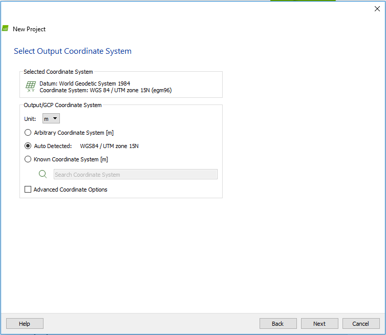
Step 6: Select Output Coordinate System

Figure 6: Select output coordinate system 
Leave in defaulted selection (Figure 6). The imagery can be reprojected later in a GIS program if need be. 

Click 'Next'

Step 7: Processing Options Template

Figure 7: Processing options template
Pix4D offers many processing templates to choose from for processing imagery (Figure 7).

For this project, select '3D Maps'

Click 'Finish'


Step 8: Processing (Part 1) 

Figure 8: Processing and the map view screen
The map view will appear on the screen. Uncheck processing steps 2 and 3 right away (Figure 8), then click on 'Processing Options' in the lower left corner


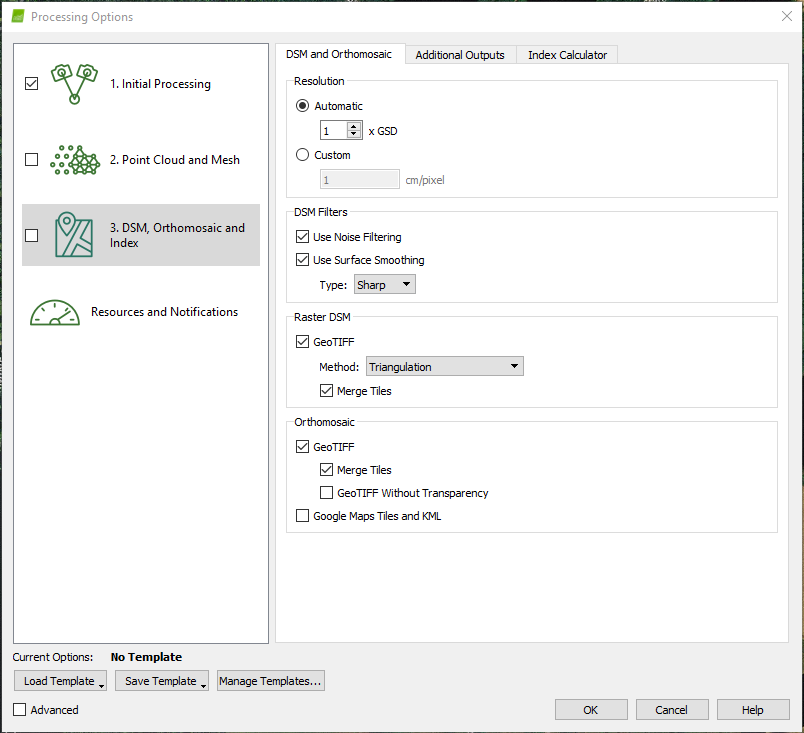
Step 9: Processing Options


Figure 9: Processing options
Click on '3. DSM, Orthomosaic, and Index' and under the 'Raster DSM' section select 'Triangulation' next to 'Method' (Figure 9)

Click 'OK'

This will return to the map view screen 

Step 10: Processing (Part 2)

Figure 10: Processing steps 1, 2, and 3
Click 'Start' and this will begin the Initial Processing. After Initial Processing is completed, a quality report will be generated. If the report is is good, continue on to processing steps 2 and 3 by unchecking step 1, checking steps 2 and 3, and clicking 'Start' once again (Figure 10). Once processing is complete, all steps will become green.


Quality Report

Figure 11: Quality report summary
Figure 12: Overlap section of quality report
The quality report provides extensive feedback on how well the imagery was processed. The report is generated after Initial Processing is complete. The 'Summary' (Figure 11) provides information such as the date and time of processing, camera model name, and the area covered. According to the 'Quality Check' section that appears just after the 'Summary', all 155 images that were selected for processing were utilized, a 100% image calibration. Further down the quality report is the 'Overlap' section which shows the number of overlapping images processed for each pixel of the orthomosaic. Green areas represent high overlap while red and yellow areas represent low overlap and can lead to poorer results in these areas. Looking at the overlap for this project (Figure 12), there appears to be good overlap overall except for some areas on the edge of the processing area, particularly on the south and north edges. This may be due to there not being as many images that can be overlapped with each other at the edges as compared to areas towards the middle of the orthomosaic. 


Fly-Through Animation

The final part to be completed in Pix4D is to create an animation that flies through the orthomosaic. This can be done through the following steps:
  • Click on 'rayCloud' on the left side underneath 'Map View'
  • Click on the 'New Video Animation' button (the one that looks like a video camera) underneath the 'Create' tab
  • This will bring up the 'Video Animation Trajectory Creation' screen; accept the default and click 'Next'
  • This will bring up the 'Record Video Animation Trajectory Waypoints' screen; from here select the desired camera angle and orientation and click 'Record Trajectory Waypoint' and keep doing this until all desired waypoints have been added
  • Click 'Next' to continue to 'Rendering Options'
  • Select the desired length of time of the animation, give it a name, and click 'Finish'
  • The animation can be played back and the duration/speed of the animation can be adjusted accordingly; when the animation is suitable, click 'Render' under the 'Video Rendering' section and save it to the appropriate folder 
  • The animation for this project can be viewed in the 'Results/Discussion' section below

Results/Discussion

Figure 13: Final maps including hillshaded DSM (left)
and orthomosaic (right)
Pix4D created a DSM and an orthomosaic which could then be used in ArcMap for further analyses and map-making. Figure 13 features the DSM with hillshade on the left side while the orthomosaic is on the right. A hillshade was ran on the DSM, then given a diverging color symbology and set over the top of the DSM with a translucent effect of 35%. Green areas represent low shade while red areas represent high shade. When comparing these areas of extreme low to high shaded relief to the orthomosaic, many of them represent large piles of sand. In the orthomosaic, the grey/golden areas are the mine and the sand itself. A road running north/south on the right side of the image is clearly visible as it turns into the mine in two different places. A aqua blue body of water just barely appears on the northwestern edge of the 
image while a group of thick trees appears in the middle of the southern edge of the image and just barely on the east side of the image as well. 

 Here is the animation created in Pix4D of the processed Litchfield Flight data which shows the 3D imagery very well by capturing the image from multiple angles at different orientations.


Conclusion

Based simply off of this one activity, which just introduces students to the software without getting into "very advanced" territory, Pix4D seems like a pretty easy program to use and it runs and processes smoothly. All of the steps in setting up the project seem pretty straight forward, although if Dr. Hupy hadn't assisted students in a couple of sections with tips (such as changing the 'Raster DSM' 'Method' to 'Triangulation' in 'Processing Options') the project may not have gone as smoothly. If a user does get tripped up, the program offers many resources for assisting those who are in need of help along the way. I was surprised how easy it was to create the animation of the orthomosaic at the end of the project. Overall Pix4D seems like a good program to use for processing UAS imagery. 

Monday, February 20, 2017

Constructing Maps with UAS Data

Introduction

Why are proper cartographic skills essential in working with UAS data?

      It is important to communicate the geographic information associated with UAS data to an observer in a way that they will understand what is being conveyed on the map.  

      What are the fundamentals of turning either a drawing or an aerial image into a map?

            There are several key elements that should be included in a map such as 1) a legend, 2) a title, 3) a north arrow, 4) scale, 5) citation information, 6) watermark, 7) a border, and 8) a locator map

      What can spatial patterns of data tell the reader about UAS data? Provide several examples.

          Examples:  

          Wetlands monitoring: Using orthophotos derived from photographs taken by a UAS in conjunction with radar data to determine phenology and land cover change in wetlands

    Farming: UAS can detect nitrogen levels, growth levels, and with infrared sensors can detect photosynthesis efficiency in plants. 

      What are the objectives of the lab?

           The objectives of this lab are to gain an understanding of the difference between an aerial image and a map and using UAS data to create proper maps that include the necessary elements previously discussed in a way that makes it easy to understand for anyone. 


Methods


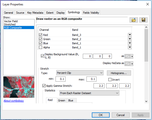
For this exercise, Dr. Hupy provided UAS data from the Hadleyville Cemetery which was then copied and pasted into the personal student folder and renamed 'Hadleyville'. This data, and the map created from it, was analyzed using ArcMap. After establishing a connection to the student's personal folder that contained the 'Hadleyville' folder, both the DSM and the orthomosaic were added to the data frame by clicking and dragging each raster from the catalog. Next, statistics needed to be calculated on the DSM which was done by right-clicking on the raster file in the catalog and scrolling down and selecting 'Calculate Statistics'. 

What is the difference between a DSM and a DEM?

     A DSM is a Digital Surface Model whereas a DEM is a Digital Elevation Model. A DSM gathers elevation values of a surface using LiDAR and captures natural and built features such as trees and buildings. Applications using DSMs can include runway approach zone encroachment, vegetation management, and view obstruction. A DEM, on the other hand, gathers elevation values but cuts through the natural and built features resulting in a smooth, bare-earth elevation model. Applications using DEMs can include hydrologic monitoring, terrain stability, and soil mapping. 

What is the difference between a Georeferenced Mosiac and an Orthorectified Mosaic? 

     A georectified mosaic is one that has been digitally aligned with a map of the same area. A number of control points are marked on both the image and the map that are then used as reference points for further processing of the image. An orthorectified mosaic is one where the geometry of the image has been corrected so that each pixel appears to have been acquired from directly overhead and it uses elevation data to correct terrain distortion. 


Figure 1: Calculated statistics of the Hadleyville DSM
To view the statistics that were previously calculated, go into 'Properties' and under the 'Source' tab scroll down until the bold heading on the left-hand side read 'Statistics' (Figure 1).

What are those statistics? Why use them?

The calculated statistics for the Hadleyville DSM are as follows:

  • Minimum: 283.36
  • Maximum: 310.46
  • Mean: 289.35
  • Standard Deviation: 4.45 
These statistics reveal the surface elevation patterns where the lowest value is 283.36 meters, the highest value is 310.46 meters, and the average elevation value is 289.35 which is much closer to the minimum value as opposed to the maximum value, which suggests there are a greater number of lower elevations compared to higher elevations. Knowing these patterns can be very useful for the reader depending on the application of the DSM. 


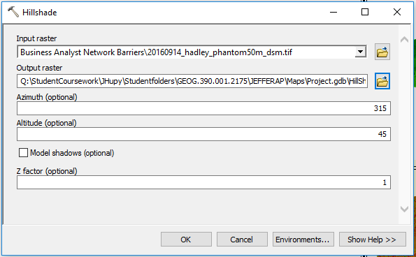
Figure 2: 'Hillshade' tool window
After looking at the statistics of the DSM, the next step was to run the Hillshade tool on the DSM. Hillshade reveals shaded relief from a source of illumination. To do this, type "Hillshade" into the search bar and click on 'Hillshade (Spatial Analyst)' when the search results come through. This opens the 'Hillshade' tool window (Figure 2). Under the 'Input raster' tab, select the Hadleyville DSM and save it into the appropriate geodatabase for this exercise in the 'Output raster' box. Click 'OK' and let the 'Hillshade' tool run the analysis.

After completing the hillshade on the DSM, an oblique 3D image needed to be produced of the DSM. This was done in ArcScene where the DSM was added to the data frame, and under 'Properties' under the 'Base Heights' tab, the elevation features were set to a custom surface (the DSM). Then under 'Scene Properties', the vertical exaggeration was set to '0.1' to produce the exaggerated 3D image. The image was then exported as a 2D JPEG which could then be utilized in ArcMap. 


Results/Discussion

Figure 3: Hadleyville delineated 3D map (top) and
hillshaded map (bottom)

The result is a hillshaded map which is overlaid on top of the DSM and given a 50% transparency value (bottom of figure 3). Green values are low shaded relief while red values are high shaded relief. The green values appear to concentrate on the southeast side of the vegetation while the red values tend to concentrate on the northwest side of the vegetation. This suggests the source of illumination of the DSM was out of the southeast. Above the hillshaded map is the delineated 3D image brought in from ArcScene (top of figure 3). Green areas are areas of low elevation while red areas are those of high elevation. The image is broken up into five sections where 1 = trees, 2 = the cemetery, 3 = crop field, 4 = the road, and 5 = vegetation. 

For discussion purposes, the DSM and orthomosaic images have been included as well (Figure 4).


Figure 4: Hadleyville DSM (top) and
orthomosaic (bottom) images

What types of patterns are noted on the orthomosaic?


Patterns that can be noted in the orthomosaic image include the following:

  • A long and narrow grey colored object with parallel boundaries and dashed lines cutting through the middle of it, indicating a road
  • A rectangular shaped area of grass in the middle of the image that contains small, white and grey colored spots that are arranged in disjointed lines, indicating a possible man-made area of some sort
  • Groups of trees in the southwest corner of the grassy area and along a stretch east and extending south from this area
  • Vegetation to the south and west of the grassy area arranged in neat rows indicating a crop field of some kind
  • Vegetation with no distinct patterns north of the road


What patterns are noted on the DSM? How do these patterns align with the DSM descriptive statistics? How do the DSM patterns align with patterns with the orthomosaic?

Patterns that can be noted on the DSM include the following:
  • A dark grey line running east to west towards the top of the image with thinner, darker lines appearing above and below the thicker line
  • A rectangular shape in the middle of the model with fairly uniform coloring
  • A rectangular shape in the west and south part of the model with fairly uniform coloring, where the western section has some darker shades of grey
  • Very light grey to white colored blotches with very rough edges appearing in the southwest corner of the middle rectangular shape and to the east and extending south of the same shape
It should be noted that medium to dark grey colors make up a large portion of the model. Black and dark grey colors represent low elevation areas while very light grey and white areas represent high elevation. Relating back to the statistics that were calculated for this DSM, it makes sense that the mean value was 289 when the minimum was 283 and the maximum 310. The mean value is closer to the minimum value (dark grey) rather than the maximum value (light grey/white) which indicates the image should contain more colors that are dark than light and it does.

The light grey/white blotches on the DSM match up directly with the trees in the orthomosaic. The dark grey line running east to west matches up with the road in the orthomosaic and the thinner, darker lines above and below the thicker line are probably ditches. The rectangular area in the middle of the model with uniform color matches up with the grassy, rectangular area in the mosaic. And what appears to be a crop field in the mosaic aligns directly with the rectangular shape with uniform color west and south of the middle area. 


Where is the data quality the best? Where is poor data quality noted? How might this related to the application?

The data quality appears to be the best in the middle area of the image while the poor data quality can be noted along the edges of the mosaic and the DSM, particularly on the lower right side of the DSM and on the right side of the mosaic where the road is cut off. This is probably related to the application in that the area of interest was the grassy, rectangular area in the middle of these rasters, therefore the quality is greatest within that area and decreases going away from that area.


Conclusion

As a tool, UAS data is useful to a cartographer and GIS user because it can be analyzed in so many and has numerous real life applications. Combining it with cartographic elements can help communicate the geographic information that is associated with it to people in a way that they will be able to understand what taking place on the map. All UAS have limitations which can include, but not limited to, sensor quality and capabilities, pilot experience, GPS quality if data is collected using GPS, weather conditions, and UAV quality. When it comes to working with collected data, the user should know the platform and sensor that was used, who collected the data, and the conditions of the flight, among other things. To make UAS data more useful, it could perhaps be combined with satellite imagery for certain types of analyses.

Sources

Wetland monitoring example:  https://books.google.com/books?id=BHwZBwAAQBAJ&pg=PA213&lpg=PA213&dq=what+can+spatial+patterns+of+data+tell+someone+about+UAS+data&source=bl&ots=vP1FpsAjHo&sig=YdB2SA_a3MPNPD4GiWMY9S9yeY8&hl=en&sa=X&ved=0ahUKEwijo6CJ1JrSAhUK5YMKHfqjAnsQ6AEIJTAC#v=onepage&q=what%20can%20spatial%20patterns%20of%20data%20tell%20someone%20about%20UAS%20data&f=false 

Farming example: http://news.nationalgeographic.com/news/2013/12/131202-drone-uav-uas-amazon-octocopter-bezos-science-aircraft-unmanned-robot/

DEM and DSM information: http://gisgeography.com/dem-dsm-dtm-differences/

Georectification definition: http://support.esri.com/other-resources/gis-dictionary/term/georectification

Orthorectification definition: http://support.esri.com/other-resources/gis-dictionary/term/orthorectification